Code
library(tidyverse)library(tidyverse)Raven matrices are a timeless task wherein participants see matrices with patterned properties and must skillfully select the appropriate matrix to complete the grid. For this task, participants were assigned to lists of items. Items did not cross lists, so participants only saw the same items as the other participants assigned to their list.
To analyze how this task performed with fewer items, for each list of items, we subsetted various numbers of items from the test and calculated the magnitude of the sum scores on those items’ correlations with s-scores. For each combination of list id and number of items, we repeated this 1,000 times.
Displayed below are the results of three different individual lists of raven matrices.
readRDS(here::here("Data", "Raven", "rav_1_12_18.rds")) |>
  summarize(.by = c(listid, n_items),
            across(cor, list(mean = mean,
                             lower = ~ quantile(.x, 0.05, names = FALSE),
                             upper = ~ quantile(.x, 0.95, names = FALSE)))) |>
  ggplot(aes(x = n_items, y = cor_mean)) +
  geom_line(linewidth = 1.5, color = "slategray") +
  geom_ribbon(aes(ymin = cor_lower, ymax = cor_upper),
              alpha = .3, fill = "slategray") +
  facet_wrap(~ listid, nrow = 1) +
  coord_cartesian(ylim = c(.3, .7)) +
  labs(y = "Correlation with S-Scores", x = "Number of Items") +
  guides(x = guide_axis(cap = "both"), y = guide_axis(cap = "both")) +
  theme_classic() +
  theme(strip.background = element_blank(),
        strip.text = element_text(color = "slategray",
                                  face = "bold", size = 16))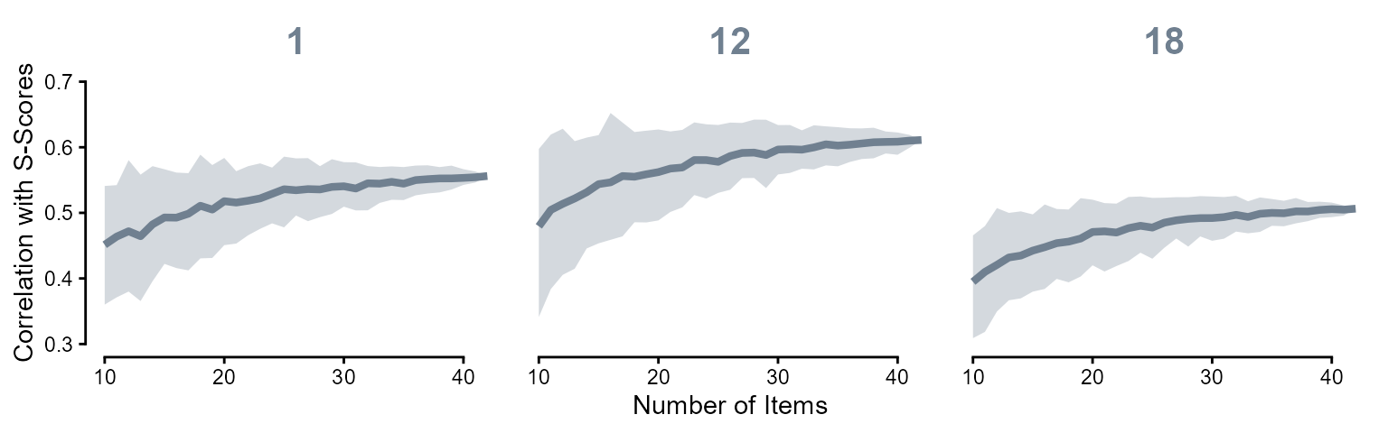
We can see the correlations of course decrease with fewer items included.
Displayed below are the results across all lists of raven matrices. There seems to be strong variation in the correlation of the items on the list with s-scores. One list barely exceeded \(r = .2\). The strongest correlation list was 0.78, and these correlations mostly trend in the .35–.65 range.
(readRDS(here::here("Data", "Raven", "rav_all.rds")) |>
  summarize(.by = c(listid, n_items),
            across(cor, list(mean = mean,
                             lower = ~ quantile(.x, 0.05, names = FALSE),
                             upper = ~ quantile(.x, 0.95, names = FALSE)))) |>
  ggplot(aes(x = n_items, y = cor_mean, group = listid)) +
  geom_line(linewidth = 1.5, color = "slategray", alpha = .4) +
  geom_ribbon(aes(ymin = cor_lower, ymax = cor_upper),
              alpha = .1, fill = "slategray") +
  coord_cartesian(ylim = c(.1, .8)) +
  labs(y = "Correlation with S-Scores", x = "Number of Items") +
  guides(x = guide_axis(cap = "both"), y = guide_axis(cap = "both")) +
  theme_classic()) |>
  plotly::ggplotly()
The x-axis represents the number of items included in the correlation, and the y-axis represents the magnitude of the correlation with s-scores. Shaded areas represent the 90% interval of the correlation values.